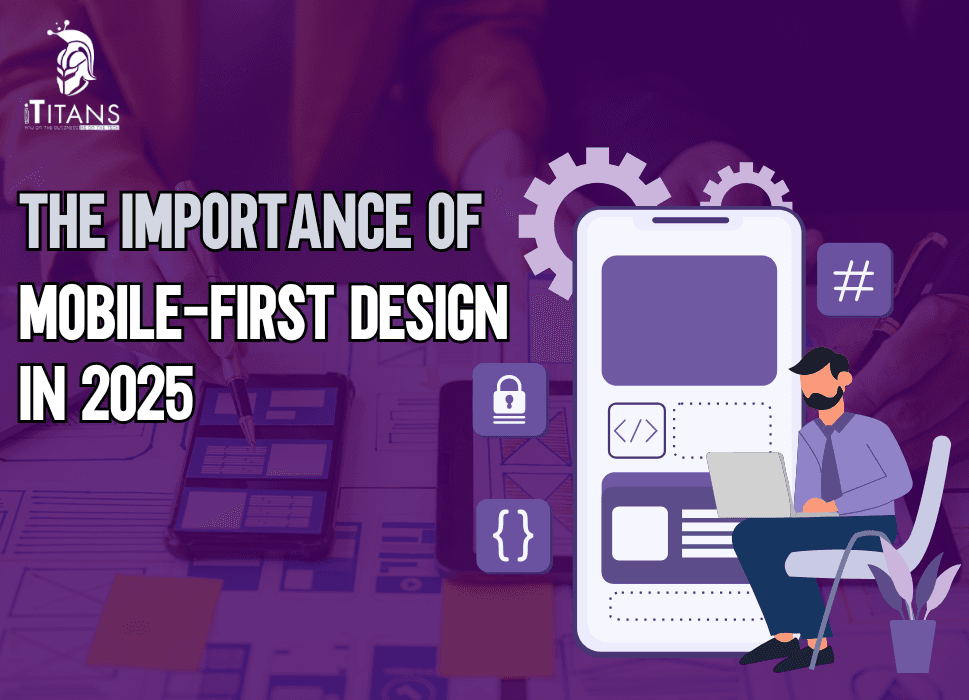
The Importance of Mobile-First Design in 2025
In an increasingly digital world, the way people interact with websites and applications has shifted dramatically. Mobile devices now dominate internet usage, surpassing desktop computers by a significant margin. As of 2025, mobile-first design is not just a trend; it’s a necessity for businesses striving to remain relevant and competitive.
This article will explore the concept of mobile-first design, its importance in 2025, and how it shapes user experiences, search engine rankings, and business growth.
What is Mobile-First Design?
Mobile-first design is an approach to web and mobile app development where the design process begins with the smallest screen—mobile devices—and scales up to larger screens, such as tablets and desktops.
This strategy prioritizes mobile users, focusing on delivering optimal performance, usability, and functionality on smartphones and other mobile devices. Instead of designing for desktops first and retrofitting for smaller screens, mobile-first design ensures that mobile users have the best experience right from the start.

Why Mobile-First Design Matters in 2025
1. The Surge in Mobile Usage
Mobile devices have become the primary tool for accessing the internet. According to recent studies, over 60% of global web traffic now comes from mobile devices. This figure is expected to rise further as smartphones become more affordable and internet connectivity expands.
2. Google’s Mobile-First Indexing
In 2025, Google continues to prioritize mobile-first indexing, meaning the mobile version of your website is the primary factor in determining search rankings. If your website isn’t optimized for mobile, you risk losing visibility in search engine results.
3. User Expectations Have Evolved
Today’s users demand fast-loading, visually appealing, and easy-to-navigate websites. A mobile-first approach ensures that your design meets these expectations, keeping users engaged and satisfied.
4. Competitive Advantage
Businesses that embrace mobile-first design gain a competitive edge by reaching customers where they spend the most time—on their mobile devices. It’s not just about meeting user needs; it’s about exceeding them.
Key Benefits of Mobile-First Design
1. Enhanced User Experience (UX)
Mobile-first design simplifies navigation, ensures readability, and optimizes functionality for smaller screens. When users can easily interact with your website or app on their phones, they’re more likely to stay engaged and return.
2. Faster Loading Speeds
Mobile-first design emphasizes lightweight, efficient design elements. Faster loading speeds not only improve user satisfaction but also boost your search engine rankings.
3. Higher Conversion Rates
When users can seamlessly navigate your site, find what they need, and complete actions—such as making a purchase or signing up—they’re more likely to convert.
4. Improved SEO Performance
A mobile-first website aligns with Google’s preferences for mobile-friendly sites, improving your chances of ranking higher in search results.
5. Cost Efficiency
By designing for mobile first and scaling up, businesses can avoid the costly process of retrofitting desktop designs for smaller screens.
Mobile-First Design Principles
To fully leverage the benefits of mobile-first design, businesses must adhere to specific principles:
1. Prioritize Content
Mobile screens are limited in size, so prioritize essential content. Remove clutter and focus on delivering clear, concise information.
2. Responsive Design
Ensure your website or app adapts seamlessly to different screen sizes. A responsive design ensures consistent functionality across devices.
3. Touch-Friendly Elements
Design buttons, menus, and other interactive elements to be easily tappable on small screens. Avoid tiny links or overly complex navigation.
4. Optimize for Speed
Minimize file sizes, compress images, and use efficient coding practices to reduce loading times. Users expect fast experiences on mobile devices.
5. Use Scalable Typography
Ensure text is legible without zooming. Use scalable fonts and appropriate spacing to enhance readability.
6. Test on Multiple Devices
Test your design on various devices and screen sizes to ensure it performs well across the board.

Mobile-First Design in E-Commerce
For e-commerce businesses, mobile-first design is particularly crucial. With a significant portion of online shopping now happening on mobile devices, providing a seamless shopping experience is essential.
Key Considerations for E-Commerce:
– Simplified Checkout Process: A mobile-friendly checkout process reduces cart abandonment.
– Mobile Payment Integration: Support payment options like Apple Pay, Google Pay, and PayPal for convenience.
– Product Visibility: Optimize product images and descriptions for smaller screens.
– Personalization: Leverage AI to deliver personalized recommendations based on user behavior.
Challenges of Mobile-First Design
While mobile-first design offers numerous benefits, it also comes with challenges:
1. Limited Screen Space
Designing for smaller screens requires prioritizing content and making tough choices about what to include.
2. Performance Optimization
Balancing performance with visual appeal can be tricky. Overloading a mobile design with features can compromise speed.
3. Testing Across Devices
With the wide variety of devices and screen sizes available, thorough testing is essential to ensure compatibility.
4. Complex Navigation
Simplifying navigation without losing functionality requires careful planning and user testing.
Despite these challenges, the benefits of mobile-first design far outweigh the drawbacks. Businesses that invest in overcoming these hurdles will see significant returns.
How Mobile-First Design Impacts Business Growth
1. Increased Accessibility
A mobile-first approach ensures that your website or app is accessible to a broader audience, including those who primarily use mobile devices.
2. Better Brand Perception
A mobile-friendly design conveys professionalism and a user-focused approach, enhancing your brand reputation.
3. Higher Engagement
Users are more likely to interact with a site that offers a smooth and enjoyable mobile experience.
4. Boosted Revenue
By meeting users where they are—on mobile—you increase the chances of conversions and revenue growth.
Future of Mobile-First Design in 2025 and Beyond
As technology continues to evolve, mobile-first design will become even more integral to digital strategies. Key trends to watch include:
1. 5G Integration
Faster internet speeds will enable richer, more interactive mobile experiences.
2. Voice and Gesture Control
Mobile-first designs will incorporate voice commands and gesture-based navigation to enhance usability.
3. Augmented Reality (AR)
AR features will become more common in mobile-first designs, particularly in e-commerce and gaming.
4. AI-Powered Personalization
AI will deliver hyper-personalized experiences, tailored to individual user preferences.
5. Progressive Web Apps (PWAs)
PWAs, which combine the best of websites and apps, will play a larger role in mobile-first strategies.
Things to take Care of With Mobile First Design in 2025
The importance of mobile-first design in 2025 cannot be overstated. Businesses that delay adopting this approach risk falling behind competitors, losing customers, and missing out on growth opportunities.
Investing in a mobile-first strategy demonstrates a commitment to meeting customer needs and staying ahead in a competitive digital landscape.
How iTitans Can Help Build Future Ready Mobile Apps
At iTitans, we specialize in crafting mobile-first designs that drive results. Our team of skilled designers and developers ensures your website or app delivers exceptional user experiences across all devices. Why Choose iTitans?
– Expertise: Years of experience in mobile-first design.
– Custom Solutions: Tailored designs to meet your business goals.
– Performance Focus: Optimized for speed, usability, and SEO.
– Cutting-Edge Technology: Leveraging the latest tools and trends.
Whether you’re launching a new website or revamping an existing one, iTitans is here to help you succeed in 2025 and beyond.
Conclusion
Mobile-first design is no longer optional—it’s essential. In 2025, businesses must prioritize mobile users to stay relevant, improve user experiences, and achieve growth. By adopting a mobile-first approach, you position your business for success in a mobile-dominated world.
Partner with iTitans to create a mobile-first design that sets you apart. Contact us today to get started on your journey toward digital excellence.
FAQs
Should we design mobile first or desktop first?
Always develop the desktop version of the website first and then convert it to optimize for mobile since it becomes easier to adjust for mobile view later.
Is desktop more popular or mobile?
The global market share of mobile apps is about 59.92% as compared to the desktop market which holds only the 37.87%.
Which technology is the best for mobile app development?
Flutter and React Native are the best technologies for mobile app development in 2025 as both of these frameworks offer smooth navigation and unique design aspects with optimal performance.