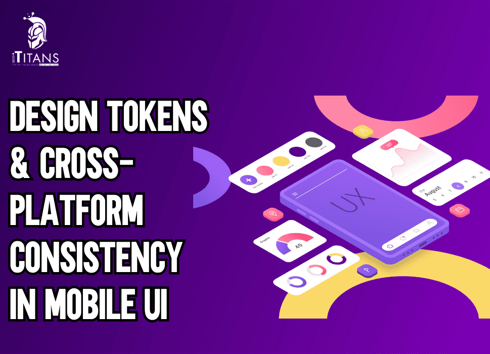
Design Tokens & Cross-Platform Consistency in Mobile UI
Mobile applications are no longer tied to a single platform. A brand today needs to ensure that its app works just as smoothly on iOS as it does on Android, and sometimes even across web platforms.
But here’s the challenge: maintaining consistent design across platforms while dealing with different codebases, frameworks, and devices. That’s where design tokens step in as the backbone of cross-platform design systems.
Instead of treating UI elements as random visual components, design tokens turn them into systemized, reusable variables that can be applied across any platform. Think of them as the DNA of your user interface, defining colors, typography, spacing, borders, shadows, and much more in a unified way.
By doing this, design teams avoid duplication, developers cut down repetitive work, and users get a seamless experience no matter where they interact with your brand.
In this blog, we’ll explore how design tokens solve the problem of design inconsistency, why they’re crucial for modern mobile UI, and how to implement them effectively in cross-platform mobile app development.

What Are Design Tokens?
At their core, design tokens are the smallest pieces of a design system expressed in a format that both designers and developers can understand.
Instead of describing a button color as “blue” in Figma and coding it separately as #0044ff in CSS or Swift, tokens define that property once and apply it everywhere.
For example:
{
“color”: {
“primary”: {
“value”: “#0044ff”
}
}
}
This JSON snippet defines a primary color token. Whether the developer is working with React Native, SwiftUI, or Jetpack Compose, they’ll pull the same token for consistency. No more “slightly different shades of blue” on iOS and Android.
Tokens aren’t limited to colors, they can define typography scales, line heights, padding, icon sizes, border-radius values, shadows, and motion curves.
Why Consistency Matters in Mobile UI
Imagine opening a banking app on your Android phone and then later accessing it on your iPad. If the typography looks different, buttons feel misaligned, and brand colors shift slightly, your trust in the product decreases. Users subconsciously link visual inconsistency with poor quality.
This is especially true for mobile apps, where users spend an average of 4.8 hours per day globally (Statista 2025). When you’re competing for that attention, delivering a consistent, familiar experience across platforms is non-negotiable.
Consistency in mobile UI leads to:
- Stronger brand identity: Colors, typography, and interactions feel unified.
- Improved usability: Users don’t have to “re-learn” navigation between platforms.
- Faster design-to-development handoff: Fewer corrections during implementation.
- Reduced long-term costs: Design debt doesn’t accumulate across platforms.
Without design tokens, teams risk duplicating UI definitions, introducing inconsistencies, and wasting time debugging design issues instead of focusing on features.
Staff Struggles Without Tokens
Let’s look at a common scenario. A design team defines a style guide in Figma with detailed rules: primary buttons should have a radius of 8px, padding of 16px, and a background color of #0044ff.
When these specs reach the development team:
- The Android developer may set the radius as 10dp because they thought it looked better.
- The iOS developer may accidentally use a slightly different hex color.
- The web developer, copying from the style guide, may forget the padding update.
The result? Three versions of the “same” button. Over time, these small differences accumulate into design debt, breaking the consistency users expect.
With design tokens, this doesn’t happen. The specs are pulled directly from the design system, leaving no room for misinterpretation.
Design Tokens vs Traditional Style Guides
Traditionally, companies relied on static style guides, PDFs, Figma libraries, or brand manuals, to maintain consistency. While these guides were useful, they had one major flaw: they weren’t executable.
- A designer updated the button radius in the guide, but unless every developer manually updated their code, inconsistencies remained.
- Style guides quickly became outdated, and version control was almost impossible.
Design tokens solve this by making style definitions executable. Instead of being “rules” on paper, they are actual variables in the codebase. Update the token once, and every platform reflects the change instantly.
This makes tokens the bridge between design and development, ensuring that both speak the same language.
Types of Design Tokens
Not all tokens are created equal. They can be broadly categorized into:
- Global Tokens
- Define universal values used across the system (e.g., brand colors, typography scales).
- Example: color.primary = #0044ff
- Define universal values used across the system (e.g., brand colors, typography scales).
- Alias Tokens
- Apply global tokens in context.
- Example: button.primary.background = color.primary
- Apply global tokens in context.
- Component Tokens
- Define styles for specific components.
- Example: button.primary.padding = 16px
- Define styles for specific components.
This hierarchy ensures flexibility while keeping design consistent. If a brand updates its primary color, every alias and component linked to it updates automatically.

Benefits of Using Design Tokens in Cross-Platform UI
Implementing tokens isn’t just about design consistency, it impacts the entire product lifecycle.
- Faster Development Cycles: Developers don’t waste time translating designs manually.
- Scalability: Adding new platforms (like wearables or smart TVs) becomes easier because tokens can be applied universally.
- Collaboration: Designers, developers, and product managers work with a single source of truth.
- Accessibility: Tokens allow standardizing accessible colors, font sizes, and spacing across all platforms.
A real-world example comes from Salesforce’s Lightning Design System. Their use of design tokens enabled them to maintain consistency across a suite of enterprise apps while reducing duplication and rework.
The Role of Tokens in Cross-Platform Design Systems
Cross-platform frameworks like React Native, Flutter, and Xamarin already make it easier to reuse code. But without design tokens, visual consistency still suffers.
For example, Flutter widgets may render slightly differently on iOS and Android. If the design system doesn’t define tokens, you’ll end up customizing each platform manually. Tokens bring that missing layer of standardization.
In a cross-platform setup, tokens act as:
- Source of truth: A single definition that applies to all platforms.
- Automation driver: They integrate with CI/CD pipelines, updating UI instantly.
- Future-proofing tool: As brands expand to AR, VR, or wearables, tokens extend seamlessly.
How Tokens Improve Developer Workflows
Ask any developer, and they’ll tell you: inconsistent design specs are one of the most frustrating blockers.
With tokens:
- They pull from a shared library instead of retyping values.
- Token changes propagate automatically through GitHub workflows.
- Design changes don’t require manual code updates in multiple files.
The result is reduced human error, fewer bugs, and cleaner codebases.
Why Cross-Platform Consistency Matters in Mobile UI
When users switch from iOS to Android or from a mobile app to a web dashboard, they expect the experience to remain consistent. A button that looks blue and rounded on iOS but sharp-edged and green on Android can confuse the user and weaken brand identity.
This is where design tokens step in, they ensure that no matter the platform, the visual and functional identity of your app stays intact.
Think about global brands like Airbnb, Uber, or Spotify. Their interfaces feel familiar whether you’re using them on a phone, tablet, or laptop. This level of cross-platform consistency doesn’t happen by chance.
It’s the result of a structured system where design tokens for mobile apps control elements like colors, typography, spacing, and component sizes across multiple platforms.
Without tokens, developers often end up hardcoding values. This not only creates inconsistencies but also makes updating design standards nearly impossible at scale.
By centralizing design decisions in tokens, updates become quick and seamless, change a token once, and it reflects everywhere.
How Design Tokens Improve Cross-Platform Workflows
Design and development teams have long struggled with bridging the gap between design files and actual code. Designers create pixel-perfect screens in Figma or Sketch, but when those designs get handed off, developers often interpret them differently based on the platform they are working on. The result? Disconnected user experiences.
Design tokens solve this by acting as a universal translator.
- For designers, tokens are stored in tools like Figma plugins or Style Dictionary.
- For developers, tokens translate into usable code snippets in CSS, Swift, or Kotlin.
This alignment reduces friction, eliminates duplication, and accelerates product delivery. A design decision made once becomes reusable across multiple platforms, ensuring consistent UI in mobile development.
Key Components of Design Tokens for Mobile Apps
To truly understand how tokens build cross-platform UI consistency, let’s break down the major elements:
1. Color Tokens
Colors define brand personality. Instead of hardcoding HEX codes in multiple places, you define tokens like color.primary or color.success.
For example:
- color.primary = #007AFF
- color.success = #34C759
Now, whether it’s a CTA button in an iOS app or a success alert in Android, the color looks the same everywhere.
2. Typography Tokens
Fonts, sizes, and line spacing often vary across platforms. Tokens like font.heading.h1 or font.body.small make sure your mobile app typography looks consistent across operating systems.
3. Spacing Tokens
Padding and margins define structure. By using tokens like spacing.xs = 4px, spacing.sm = 8px, spacing.md = 16px, you ensure consistent spacing across all layouts.
4. Border & Radius Tokens
Consistency in rounded corners, borders, and dividers adds polish to the design. For instance, border.radius.medium = 8px makes buttons uniform across platforms.
5. Shadow & Elevation Tokens
Shadows behave differently in iOS and Android. Tokens ensure that shadows maintain a unified look regardless of system-rendering differences.
These elements may sound small, but together they define brand consistency in mobile UI systems.
The Role of Design Tokens in Design Systems
A design system is a structured library of reusable components, patterns, and guidelines. Design tokens act as the foundation of that system. Without them, scaling a mobile app’s UI across platforms is chaotic.
For example, if a company rebrands and changes its primary color, a system without tokens requires developers to hunt down hundreds of instances in code. With tokens, they only update one definition, and the new color is instantly reflected everywhere.
This not only maintains mobile app design consistency but also drastically reduces errors. Tokens also make collaboration smoother between designers and developers, since both sides rely on the same source of truth.
Tools That Support Design Tokens
Several tools make managing tokens easier:
- Style Dictionary: An open-source tool by Amazon for token management across platforms.
- Figma Tokens Plugin: Directly integrates tokens into design workflows.
- Supernova: Converts design tokens into code.
- Theo: Another popular framework for token transformations.
These tools automate token distribution across platforms, saving teams countless hours.

Common Challenges in Maintaining Cross-Platform Consistency
While design tokens for mobile apps solve many problems, teams still face challenges:
- Multiple Platforms with Different Needs: iOS, Android, and web have different design guidelines. Tokens must balance standardization with platform-specific tweaks.
- Version Control: Updating tokens must be carefully managed to avoid breaking existing components.
- Adoption Resistance: Developers and designers used to their workflows may resist new processes.
- Scalability Issues: As apps grow, keeping tokens organized and manageable becomes harder.
Addressing these challenges requires good governance and a clear documentation strategy.
Case Study: Spotify and Design Tokens
Spotify faced the challenge of maintaining a consistent look across its mobile, desktop, and web apps. With over 450 million active users worldwide, even minor inconsistencies could impact brand identity.
By adopting a design token-driven system, Spotify standardized key elements like color, typography, and spacing. This allowed them to scale updates across multiple platforms quickly.
When Spotify updated its green brand color, it only needed a single token update. The change reflected across hundreds of UI components globally, saving time, reducing errors, and ensuring cross-platform consistency.
This example highlights why tokens are not just a technical tool but a business necessity for scaling digital products.
Benefits of Using Design Tokens in Mobile UI
To recap, here are the most important benefits:
- Consistency Across Platforms: Uniform colors, fonts, and components.
- Faster Development: Tokens accelerate coding by providing ready values.
- Easy Scalability: One change updates everywhere.
- Reduced Errors: Avoids human mistakes in manually updating styles.
- Stronger Brand Identity: A unified look reinforces recognition.
For teams building large apps or scaling across multiple markets, tokens are the backbone of design quality.
Common Pitfalls When Implementing Design Tokens
Adopting design tokens seems straightforward, but many teams face challenges along the way. Here are the most common pitfalls to watch out for:
- Token Overload: Creating too many tokens for every small detail can cause confusion. Teams end up spending more time managing tokens than designing interfaces.
- Lack of Naming Standards: Without a consistent naming convention, developers struggle to understand the purpose of each token, especially in large-scale projects.
- Forgetting Accessibility: Tokens should also represent accessibility requirements, such as contrast ratios, scalable font sizes, and motion preferences.
- Ignoring Documentation: A token system without clear documentation makes onboarding new developers and designers difficult.
- Version Control Issues: Updating tokens without proper versioning can break existing UIs across multiple platforms.
Recognizing these pitfalls early ensures smoother adoption and long-term efficiency.
Best Practices for Cross-Platform Consistency
Consistency isn’t about making everything look identical; it’s about ensuring a unified user experience across platforms. Some best practices include:
- Define Core Tokens First: Start with foundational tokens, colors, typography, and spacing. These are universal and impact every platform.
- Use Platform-Specific Overrides: While tokens ensure consistency, each platform (iOS, Android, web) has unique interaction models. For example, spacing and shadow depths may differ on Android vs. iOS.
- Centralize Token Management: Store tokens in a single source of truth (like Style Dictionary or Figma Tokens) to avoid fragmentation across projects.
- Collaborate Across Teams: Tokens should not just be a developer’s tool. Designers, QA testers, and accessibility experts should be part of the discussion.
- Automate Token Distribution: Use CI/CD pipelines to push updated tokens into codebases automatically, reducing manual effort and human error.
The Role of Design Systems in Tokens
Design tokens are not standalone, they are part of a larger design system. A design system defines patterns, components, and principles, while tokens represent the atomic values that make up those components.
For example:
- A button in a design system may define structure, hover states, and accessibility rules.
- The tokens define the button’s color, border-radius, padding, and typography.
Together, they form a system where tokens act as the language of consistency. Without tokens, design systems become rigid; without design systems, tokens lose context.
The Business Value of Design Tokens
While tokens seem like a technical concept, they directly impact business outcomes. Companies adopting tokens see benefits such as:
- Reduced Development Costs: Updating UI values across multiple apps becomes faster and less error-prone.
- Faster Product Iterations: New features can be released without redesigning the core style system.
- Brand Trust & Recognition: Consistent experiences reinforce brand identity, making products feel reliable.
- Future-Proof Scalability: As businesses expand to new platforms (smart TVs, wearables, AR/VR), tokens allow easy adaptation.
For product leaders, this means time-to-market improves while maintenance costs shrink, a win for both design and engineering teams.
The Future of Design Tokens
The evolution of design tokens is tied to how digital experiences continue to expand. Looking ahead:
- W3C Standardization: Efforts are underway to make tokens part of web standards, which will simplify adoption across tools and frameworks.
- AI-Generated Tokens: With the rise of AI-driven design, future tools may generate token libraries automatically based on branding inputs.
- Cross-Device Expansion: Tokens will extend beyond mobile and web into emerging platforms like VR, AR, automotive UI, and wearables.
- Dynamic Tokens: Tokens that adapt in real time based on user preferences, themes (dark mode/light mode), or even environmental data like ambient light.
This shows that tokens are not just a trend but a foundation of future UI development.\

Build Consistency with ITitans
At ITitans, we help businesses implement design tokens and create cross-platform mobile experiences that users love.
If you’re ready to bring consistency and speed to your mobile UI, let’s talk today and explore how ITitans can help you stay ahead of the curve.
FAQs
Are two-tier design token systems enough for mobile UI?
Yes, most teams manage consistency well with just primitive tokens (raw values) and semantic tokens (contextual roles), keeping things simple without losing flexibility.
Can too many token layers slow down designers?
Yes, when tokens are split into too many levels, it often creates confusion and slows adoption, which is why streamlined structures are preferred.
How do design tokens help in white-label mobile apps?
Design tokens make it easy to swap colors, fonts, and themes, so multiple brands can share one design system without rewriting components.
Are design tokens effective for multi-brand mobile systems?
Yes, tokens allow brands to use the same components but apply unique branding by changing values like color, typography, or spacing.
What is the best way to structure tokens for cross-platform apps?
A common approach is three tiers: primitives (raw values), semantic tokens (meanings like “primary”), and component tokens that reference them.
Do design tokens improve cross-platform consistency?
Yes, by defining shared variables, tokens ensure iOS, Android, and web apps look consistent while adapting to each platform’s guidelines.