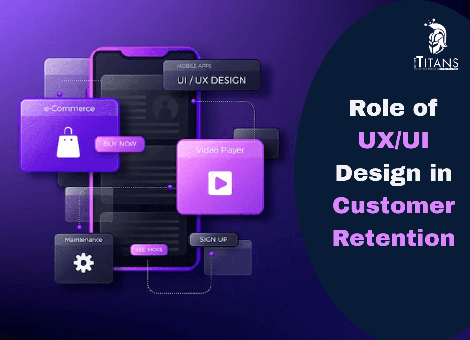
Role of UX/UI Design in Customer Retention
Think about the last app or website you loved using. You didn’t need a tutorial. Every button was where you expected. The experience felt smooth, even enjoyable. You likely returned to it again, and again, and again. That’s the power of smart UX/UI design, not just attracting users, but making sure they come back.
In 2025, where users have more choices than ever and expectations are sky-high, good design is no longer a luxury. It’s a necessity. For businesses, it’s also a major factor in retaining customers, and ultimately, in growing revenue.
In this blog post, we’ll break down how UX/UI design directly impacts customer retention, explore key design elements that drive loyalty, and highlight real-world practices businesses are using to keep their users engaged.

What Is UX/UI Design and Why Does It Matter?
Let’s get this straight first:
- UI (User Interface) is what the user sees, the layout, colors, buttons, fonts, and visuals.
- UX (User Experience) refers to how the user feels about their journey, is it smooth? Is the flow logical? Are actions intuitive?
They go hand-in-hand. A stunning interface that’s hard to use fails. A well-structured app that looks outdated also loses attention. When both are balanced, the result is customer satisfaction.
And in today’s digital world, satisfaction leads to retention.
Why Retention Is More Important Than Ever
Getting new users is expensive. Keeping them? That’s where profitability lies.
According to research:
- Improving customer retention by just 5% can increase profits by 25% to 95%.
- Over 70% of users abandon an app or website after one bad experience.
- 94% of first impressions are design-related.
So yes, your UX/UI can either build loyalty, or drive users to your competitors.
First Impressions Are Everything
It takes less than 0.1 seconds for a user to form an opinion about your product. That means you have no time to make a second impression. If your interface looks cluttered, your buttons aren’t tappable, or the font feels outdated, users might leave before they even explore what you offer.
Here’s how UX/UI helps you win that first moment:
1. Clean, Visual Hierarchy
When users land on your app or website, they should instantly know:
- Where to click
- What the product does
- What to do next
Strategic spacing, font weight, and color usage create a flow that guides the user’s eye. If they’re guessing where to go, you’ve already lost.
2. Branding Consistency
Your app should speak your brand’s voice without even saying a word. The colors, typography, and icons should feel familiar every step of the way. Consistency breeds trust. Trust brings them back.
3. Speed & Responsiveness
Even the best design fails if it lags. Users expect apps and websites to respond instantly. A delay of just 1 second can reduce user satisfaction by 16%. Your UX/UI must also adapt seamlessly across devices and screen sizes. A flawless desktop experience that breaks on mobile is no longer acceptable.
Emotional Design: Creating Connection
Design isn’t just about usability, it’s about emotion. Great UX/UI taps into human psychology.
When your design feels thoughtful, fun, or even comforting, users feel an emotional connection. This boosts loyalty.
Here’s how emotional design keeps users coming back:
1. Microinteractions
Think of the satisfying checkmark when you complete a task, or the bounce effect when refreshing a feed. These tiny interactions are more than animation, they offer feedback, closure, and a spark of joy.
2. Personalization
Users want to feel like the product is made for them. Personalized greetings, user-specific recommendations, and dynamic content enhance the user journey and build stickiness.
3. Delightful Details
Designers often call this “delight.” It’s the surprise that makes users smile, a clever animation, a playful empty state message, or even a subtle sound effect. These moments make your brand memorable.
UX/UI and Friction The Silent Killer of Retention
Nothing drives users away faster than friction.
Friction is anything that interrupts the flow: a confusing button, an unnecessary form field, a broken link. These small moments add up. If a user struggles more than once, they won’t think twice about closing your app and never returning.
Common Friction Points to Fix
- Too many steps to complete an action e.g., needing to go through five screens just to update a profile picture.
- Poor error messaging e.g., “Something went wrong” isn’t helpful. Tell users what happened and how to fix it.
- Unintuitive icons like a triangle doesn’t always mean “play.” Be obvious. Don’t make users guess.
- Lack of feedback like when users tap something, they expect a response. A loading spinner, a color change, anything to show their action was registered.

UX That Solves, Not Sells
When designing for retention, the key is to solve a user’s problem. Not push them into buying something.
Let’s take two examples:
- An e-commerce app that auto-fills delivery details based on past orders.
- A budgeting app that gives you weekly financial summaries based on your habits.
In both cases, the product isn’t just selling, it’s helping.
This kind of utility-centered UX makes users feel understood. They’re not just using the app. They’re depending on it.
And that’s where long-term retention lives.
Real-World Example: Spotify
Spotify isn’t just a music streaming service. It’s a masterclass in UX/UI design that promotes customer retention.
- The interface is clean and consistent.
- Music is personalized through features like “Discover Weekly” and “Your 2024 in Review.”
- Navigation is easy: tabs are well-labeled, content is never more than two taps away.
- Even error messages and offline states are friendly and visually appealing.
Spotify’s experience feels personal. Effortless. Even addictive. That’s why users stay.
Journey Mapping: Designing for the Long Haul
Good UX/UI doesn’t just focus on the first interaction, it maps the entire user journey. That means thinking through every screen, touchpoint, and scenario a user might go through, from onboarding to long-term use.
When you plan the journey well, users feel guided, never lost.
1. Onboarding Experience
This is your first big moment after the download or signup.
A confusing or lengthy onboarding process can frustrate users before they even begin. The goal? Help users understand the value of your product as fast as possible, with the fewest steps.
Best practices for onboarding that improves retention:
- Use progress indicators so users know how many steps are left
- Offer skip options for advanced users
- Use animations and tooltips to teach by doing, not by telling
If a user doesn’t find success quickly, they’re unlikely to stick around.
2. Contextual Guidance
Users shouldn’t be overwhelmed with information upfront. Instead, offer tips, cues, or nudges based on where they are in their journey.
For example, a fitness app might offer hydration tracking only after a user logs five workouts, not on day one. This pacing keeps the experience relevant and digestible.
3. Lifecycle Messaging
Retention design doesn’t stop at the screen. UX can extend through in-app messaging, email prompts, or push notifications.
But timing and tone matter. Instead of spammy alerts, deliver helpful nudges:
- “You haven’t logged in for 3 days. Here’s what you missed.”
- “You hit your weekly savings goal. Want to set a new one?”
These messages re-engage users without annoying them.
Accessibility and Inclusivity: Design for Everyone
If your product isn’t usable by everyone, it’s not usable enough.
Inclusive UX/UI design ensures that your product supports users with visual, motor, hearing, or cognitive challenges. Not only is this the right thing to do, but it also widens your potential audience and boosts retention among users who are often ignored.
Key Elements of Accessible Design:
- Color contrast: Not all users see colors the same way. High contrast ensures text is readable.
- Scalable fonts: Let users adjust text size without breaking your layout.
- Alt text and screen reader compatibility: Critical for visually impaired users.
- Keyboard navigation: Make sure all actions are possible without a mouse.
Accessibility isn’t just a checklist, it’s part of the experience. And when users feel seen, they’re more likely to return.

Feedback Loops That Keep Improving UX
User retention thrives on continual improvement. That means your UX/UI isn’t a one-time task, it’s an evolving process based on data, testing, and listening.
1. In-App Feedback
Let users share frustrations directly, before they uninstall.
You can use:
- Feedback buttons
- Star ratings after key interactions
- Quick surveys for feature changes
This real-time loop helps you fix friction before it becomes abandonment.
2. Session Recordings & Heatmaps
Tools like Hotjar and FullStory let you see where users tap, scroll, and drop off. This shows what parts of your UI are working, and which are confusing.
Example: If users consistently try to click a non-clickable icon, that’s a signal to redesign.
3. A/B Testing
Don’t assume. Test.
Compare two versions of a screen or button and measure which one keeps users engaged longer. A color change or button text tweak can lead to massive retention wins.
UX Trends That Boost Retention in 2025
Let’s talk about design trends that are already keeping users hooked, and will continue to dominate this year.
1. Dark Mode (User Control)
Not just an aesthetic choice, dark mode reduces eye strain and gives users control over their viewing environment. Apps offering theme toggles often see higher retention, especially among night users.
2. Gesture-Based Navigation
With more mobile-first experiences, swipes, taps, and pinches are becoming central to how users interact. Designing for gestures simplifies the UI and creates a more immersive experience.
3. Voice UI
Voice search and commands are rising fast, especially in regions with high mobile use but lower literacy. Adding voice capability (for search or navigation) makes apps more accessible and easier to use, boosting stickiness.
4. Minimalist Interfaces
Clean, clutter-free interfaces aren’t just trendy, they reduce decision fatigue. Users find what they need faster, stay longer, and leave less often.
5. Emotion-Based Design
From personalized animations to mood-based themes, brands are building designs that react to user emotions. If your product can reflect how a user feels, and respond, you’re building serious loyalty.
When UX/UI Goes Wrong: Common Pitfalls That Cost You Customers
It’s just as important to know what not to do. Here are frequent mistakes that hurt customer retention:
1. Inconsistent Design Across Platforms
Your website feels one way. Your app feels another. Users lose confidence when your identity, navigation, or functionality changes across devices.
Fix: Use a unified design system for consistency across web, mobile, and other channels.
2. Cluttered Screens
When every button screams for attention, users get overwhelmed. Cognitive load increases. Retention drops.
Fix: Prioritize core actions. Use white space to create focus. Make room for breathing.
3. Ignoring Load Times
Your design may look great, but if it takes too long to load, users won’t stick around to see it.
Fix: Optimize assets. Compress images. Keep code clean. Speed is UX.
4. Unclear CTAs (Call-to-Actions)
A user shouldn’t have to guess what button to tap next. If your CTA isn’t visible, understandable, or actionable, users might bounce.
Fix: Use clear language, “Get Started,” “Continue,” “See Pricing,” and place CTAs where they make sense in the journey.
How iTitans Approaches UX/UI for Long-Term Success
At iTitans, we design with one goal in mind: make the user stay.
Whether we’re building a mobile app, website, or enterprise dashboard, our UX/UI process focuses on flow, simplicity, and human behavior. We spend time understanding your audience, not just what they need, but what they expect.
We test obsessively. We iterate fast. And we make sure every pixel has a purpose.
Because design is not about being beautiful, it’s about being usable. Over and over again.
Personalization in UX: The Key to Loyalty
One-size-fits-all experiences just don’t work anymore. Users expect interfaces that feel made for them, not for a crowd. This is where personalized UX/UI steps in.
How Personalization Impacts Retention
Personalization isn’t just about inserting a user’s name in a greeting. It’s about showing content, features, and layouts that align with a user’s preferences and behavior.
Think of Spotify’s “Discover Weekly.” the app learns your taste, and every Monday, it delivers a playlist made just for you. That’s personalization done right, and it’s a big reason users keep coming back.
Ways to Personalize UX/UI:
- Custom dashboards based on user roles or goals
- Product recommendations based on past actions
- Location-based content to increase relevance
- Behavior-driven UI changes, like showing a “resume” button for unfinished tasks
Done well, personalization helps users feel like your app knows them, and no one abandons a product that gets them.

Consistency Breeds Familiarity and Familiarity Feeds Retention
Consistency in UX/UI is like the comfort of a familiar neighborhood. You know where everything is, how it works, and what to expect. This kind of mental ease is critical for keeping users engaged long term.
Visual Consistency
Fonts, colors, icons, button styles, they all need to match across pages and platforms. Every inconsistency is a speed bump in the user’s journey.
If the “Save” button looks different in every part of your app, users pause. That pause leads to frustration. Frustration leads to churn.
Functional Consistency
The same action should yield the same result every time. If swiping right archives emails in one section but deletes them in another, trust breaks down.
Consistency builds user confidence, and confident users are loyal users.
Microinteractions: Small Details, Massive Impact
Those tiny animations when you like a post, drag a file, or refresh a screen? They’re called microinteractions, and they do more than just look cool.
They offer:
- Feedback: Letting users know an action was successful
- Direction: Guiding users through tasks subtly
- Delight: Creating tiny moments of joy that make the experience memorable
Imagine long-form apps like fitness trackers or budgeting tools, users stay longer when they enjoy even the small parts of the journey.
At iTitans, we obsess over microinteractions because we know retention is won in the details.
Mobile-First UX Design: Where Retention Really Matters
Let’s face it: most users interact with digital products on their phones. That’s why designing mobile-first is no longer optional, it’s the default.
What Makes a Mobile UX Stick?
- Thumb-friendly design: Buttons placed where thumbs naturally reach
- Short loading times: Every second matters
- Simplified menus: Easy navigation on small screens
- Offline support: So users aren’t lost without data
When your mobile UX works flawlessly, even in poor signal areas or with one hand, you’re miles ahead of competitors who treat mobile as secondary.
Data-Driven Design for Better Retention
The best UX/UI decisions are rooted in real user behavior, not assumptions.
At iTitans, we combine analytics, heatmaps, and A/B testing to build interfaces that users actually enjoy using, not just ones that look good in a mockup.
Metrics That Matter:
- Time on task: Are users completing actions faster?
- Drop-off points: Where are users getting stuck?
- Feature usage: Which features are popular vs. ignored?
Every improvement based on data tightens the experience, and gives users fewer reasons to leave.
Trust and Transparency in UX
Customer retention isn’t just about visuals, it’s about trust.
If your app looks great but feels shady, users will leave. Fast.
UX/UI Practices That Build Trust:
- Clear permissions requests: Tell users why you need their data.
- Straightforward privacy settings: Let them control what’s shared.
- Visible contact/support options: Don’t hide your help center.
- No dark patterns: Don’t trick users into subscriptions or unwanted actions.
A trustworthy product feels different. It’s honest, user-first, and dependable, and users will come back to it.
Emotional Design: Make Them Feel Something
Great UX/UI doesn’t just function, it connects.
Design that stirs emotions can create unforgettable experiences. It can be subtle, like a success message with a celebratory animation, or more direct, like personalized messages after a user hits a milestone.
Emotional Triggers That Drive Retention:
- Achievement: Gamify progress with badges or levels.
- Belonging: Create community spaces or shared goals.
- Surprise: Delight users with unexpected rewards or easter eggs.
When users feel something, they’re more likely to remember, and return.
Design Systems: The Unsung Hero of Retention
A design system ensures that everything your users see and interact with follows a coherent logic. From buttons and icons to layouts and language, design systems eliminate inconsistency, one of the biggest enemies of retention.
At iTitans, every product we design is backed by a system. It saves development time, keeps visuals aligned, and ensures users don’t need to re-learn the interface with every update.

Final Thoughts
UX/UI isn’t just a department, it’s the heartbeat of your product. It’s what keeps users engaged after the marketing is done and the app is downloaded. From the moment they land on your homepage to every interaction after, design influences whether they stay, or leave.
In a world full of choices, it’s not enough to look good. Your product has to feel natural, familiar, and helpful. That’s the only way to build loyalty that lasts.
If you’re ready to create experiences that keep users coming back, iTitans is here to help. Contact us today.
Related Posts