Responsive vs Adaptive Design
The ever-changing digital landscape demands smart decisions, especially when it comes to your website’s design. If you’re trying to decide between responsive vs adaptive design, you’re in good company. In 2024, user experience defines your complete business strategy and responsiveness from the user end. And your choice between these two design philosophies could be the determining factor in your success online.
Let’s explore this fascinating debate in detail, breaking down what each approach really means, where each one shines (or stumbles), and which one aligns best with your website goals whether you’re running an e-commerce empire, a SaaS platform, or a small local business site.
Responsive vs Adaptive Design
At their core, both responsive and adaptive web design aim to deliver a smooth browsing experience across a wide range of devices. That’s crucial in a world where over 55% of web traffic comes from mobile devices (Statista, 2024). But the way each approach tackles this goal is what sets them apart.
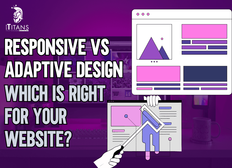
Responsive design uses fluid grids and flexible layouts to automatically adjust a site’s content to fit any screen size. It’s like water, shapeless but adaptable to any container. Whether it’s a 4-inch phone or a 27-inch monitor, the layout shifts smoothly.
On the other hand, adaptive website design uses fixed layouts for specific screen sizes. The site detects the user’s device and loads a layout that was specifically designed for that screen. Think of it as having multiple printed versions of a magazine each optimized for a different reader.

Understanding the Responsive Design Approach
Responsive design is often hailed as the default approach to modern web development. Its biggest strength? Flexibility. When you design responsively, you create a single layout system that fluidly adapts based on screen width using media queries in CSS. Content reshuffles itself like puzzle pieces that always find their place.
Responsive sites are device-agnostic, which makes them future-proof. Whether users are browsing on a smartwatch or a foldable phone, your layout adjusts. This method is cost-effective, especially for small teams or startups. You build and maintain one site that works everywhere. And thanks to frameworks like Bootstrap and Foundation, implementation is often faster and easier than it sounds.
Exploring Adaptive Design in Depth
Adaptive design takes a more targeted approach. Instead of trying to stretch and shrink the same layout, adaptive design uses a set of pre-designed layouts for common screen sizes usually six: 320, 480, 760, 960, 1200, and 1600 pixels.
When a visitor lands on the page, the server detects the device’s screen size and serves the appropriate version.
This makes adaptive design ideal for websites with very specific user needs, especially in performance-critical industries like healthcare, banking, or e-commerce. You get more control over the layout and performance optimization. However, it does come with added complexity. You may end up designing and maintaining multiple versions of your site, which can be time-consuming and expensive.
Pros of Responsive Design:
- Fluid and flexible layout for all screen sizes
- One website to maintain
- Future-proof for new devices
- Better for SEO (Google favors mobile-friendly sites)
- Lower development cost initially
Cons of Responsive Design:
- Complex layouts may break on certain devices
- Slower load times on mobile if not optimized well
- Limited control over how content appears on specific screen sizes
Pros of Adaptive Design:
- Highly optimized for known screen sizes
- Faster load times for users with specific devices
- More control over design and layout on each screen
- Potentially better UX for targeted audiences
Cons of Adaptive Design:
- Requires more design and development time
- More expensive to build and maintain
- Harder to future-proof as new devices emerge
Which Design Method is Best for SEO in 2024?
Search engine optimization is now becoming more dependent on UX. In 2024, Google’s Mobile-First Indexing is still a major influence on site rankings. Responsive design generally earns the upper hand here because it delivers a single, consistent HTML and URL across devices, making indexing more straightforward.
That doesn’t mean adaptive design is doomed—it just needs more careful execution. If your adaptive site has inconsistent URLs or duplicate content across device layouts, it might confuse search crawlers.
How Speed and Performance Play a Role
According to Google, 53% of mobile users abandon sites that take longer than 3 seconds to load. That stat alone makes performance a deal-breaker. Adaptive design usually wins in performance because it can serve lightweight layouts to mobile users. You can strip unnecessary scripts, images, and styles to keep things snappy.
But responsive design has caught up thanks to smarter image loading (like using srcset) and mobile-first CSS strategies. So if you’re working with expert developers—or platforms like iTitans, who we’ll cover shortly—you can build a blazing-fast responsive site, too.
The Impact on User Experience (UX)
UX isn’t just about looks—it’s about intuitiveness, consistency, and emotional engagement. Responsive design excels at maintaining brand consistency across devices.
Adaptive design, however, allows for contextual experiences. For instance, a mobile visitor might see a simplified checkout process, while desktop users get advanced filtering tools. That’s great for conversion-centric sites.
Deciding which is better for your UX depends on your user behavior. Use analytics tools to understand where users are coming from and what they’re doing. That data can guide your decision.
Scalability and Long-Term Maintenance
Let’s be real—web projects aren’t one-and-done. You’ll add new content, products, features, and integrations over time. Responsive design shines here. You update content once, and it works everywhere. Adaptive design can become a headache. You may need to tweak six different versions of a layout whenever a feature changes. That’s not only time-consuming—it’s a budget drainer.

When Should You Choose Responsive Design?
Responsive design is perfect if:
- You’re building a new website or redesigning from scratch
- Your audience uses a wide variety of devices
- Your budget is tight
- You need to prioritize SEO and maintainability
- You want faster time to launch
When Should You Choose Adaptive Design?
Adaptive design is best if:
- You have the team and budget to maintain multiple layouts
- Your site already has legacy infrastructure
- You need pixel-perfect control for high-value interactions
- Your performance requirements are strict
- You serve different content to mobile and desktop users
Hybrid Design Approaches
Yes, there’s a middle ground! Many modern designers combine both approaches. You can start with a responsive framework and add adaptive touches like showing different content or layout tweaks based on screen size. This lets you optimize without building six separate sites.
Is it Possible to Make Web Design Adaptive and Responsive?
Well, the short answers are Yes! It’s possible for a website to incorporate elements of both adaptive and responsive design. Many modern websites use a hybrid approach to take advantage of the flexibility of responsive design while leveraging the performance optimization of adaptive techniques.
For instance, a site might use responsive layouts for general scalability but serve adaptive images or layouts at specific screen widths. This blending creates a more refined experience across a broader range of devices.
Advantages of Combining Both Designs
The biggest advantage of mixing responsive and adaptive strategies is offering users a seamless experience regardless of device or screen size. Responsive elements ensure fluid layouts, while adaptive features allow for custom treatment of content where needed. This can lead to faster load times, better accessibility, and more personalized interactions. Businesses that prioritize both user experience and technical performance often find this combination highly effective.
Challenges of Merging Responsive and Adaptive Designs
Despite its benefits, combining both design methods can introduce complexity into the development process. Designers and developers must plan extensively to ensure the layout functions correctly across all breakpoints and screen sizes. It can also increase testing time and maintenance efforts. Moreover, implementing adaptive logic requires more code and potentially heavier assets, which can impact site speed if not optimized properly.

Technical Considerations for Implementation
To successfully merge responsive and adaptive techniques, developers must consider CSS media queries, JavaScript-based detection, and server-side logic. Responsive aspects depend heavily on flexible CSS, while adaptive design might involve user-agent detection to serve different templates or images. Implementing both requires a modular approach to coding and careful planning of content hierarchy and interaction models.
Mobile-First Design and Its Role in Hybrid Strategy
A mobile-first approach naturally complements responsive design but also lays the foundation for adaptive enhancements. By designing from the smallest screen up, developers ensure that essential content loads first and progressively add enhancements for larger screens. This strategy aligns well with hybrid models, as it encourages performance optimization and prioritization of user needs, especially on mobile devices where connectivity may be limited.
Performance Impacts of Using Both Designs
When done right, combining adaptive and responsive elements can improve performance—such as faster loading on mobile devices via adaptive image delivery. However, if not managed properly, it can also introduce performance bottlenecks. For example, overcomplicating layouts or loading redundant assets for multiple screen types can slow down the site. Efficient coding, asset optimization, and thorough testing are key to mitigating these risks.
Content Strategy in Dual Design Approaches
Content plays a critical role in how responsive and adaptive strategies are applied. In a hybrid model, designers might prioritize certain content blocks differently depending on the device. For instance, promotional banners may appear on desktop but be hidden or minimized on mobile. A successful content strategy ensures relevance and accessibility across all devices, avoiding clutter and focusing on user intent.
SEO Implications of Adaptive + Responsive Design
Search engines like Google favor mobile-friendly websites, and combining responsive and adaptive strategies can positively influence SEO. Responsive design ensures that content scales correctly, while adaptive elements like fast-loading images and minimal mobile-specific content can improve page speed and engagement metrics. A well-executed hybrid approach reduces bounce rates and increases time on site—factors that indirectly boost search rankings.
Accessibility Benefits of Combined Design
By integrating both design philosophies, websites can enhance accessibility for a wider range of users. Responsive design ensures readability and navigability across devices, while adaptive features can be fine-tuned to assist users with disabilities—such as adjusting font sizes or interaction patterns based on device capabilities. This makes the web experience more inclusive and aligned with modern accessibility standards like WCAG.
SEO Implications of Adaptive + Responsive Design
Search engines like Google favor mobile-friendly websites, and combining responsive and adaptive strategies can positively influence SEO. Responsive design ensures that content scales correctly, while adaptive elements like fast-loading images and minimal mobile-specific content can improve page speed and engagement metrics. A well-executed hybrid approach reduces bounce rates and increases time on site—factors that indirectly boost search rankings.
Maintenance and Scalability Concerns
Managing a hybrid site can be more resource-intensive than a purely responsive or adaptive one. Regular updates need to account for both layout flexibility and breakpoint-specific customizations. As new devices emerge, additional testing and tweaking may be required. However, with proper documentation and modular coding practices, scalability and future updates can be handled smoothly.
Tools That Support Hybrid Design
Several design and development tools make it easier to implement a hybrid strategy. Frameworks like Bootstrap and Foundation offer responsive grids that can be customized for adaptive behaviors. JavaScript libraries such as Modernizr can help detect device capabilities, and server-side scripts can aid in delivering specific content variations. Using the right tools reduces the manual workload and improves design consistency.
When It’s Better to Stick to One Approach
While combining both designs can be beneficial, not every project demands such complexity. For simpler websites or startups with limited resources, sticking to a well-implemented responsive design might be more practical. Adaptive features add value primarily when user behavior data or performance goals justify the extra development effort. Businesses should evaluate their audience, goals, and budget before deciding.
Striking the Right Balance
Ultimately, the goal of any web design—whether adaptive, responsive, or hybrid—is to serve users effectively. A thoughtful combination of both methods can deliver superior results, but only when guided by user experience insights and technical feasibility. By prioritizing flexibility, performance, and accessibility, businesses can future-proof their websites and provide a smooth, engaging experience across all platforms.

How iTitans Brings the Perfect Design Services for Your Website
This is where a professional partner like iTitans can make a world of difference. iTitans is a global leader in web development, UI/UX design, and digital transformation services. They’ve helped clients from startups to Fortune 500 companies implement tailored design strategies that focus on speed, scalability, and user satisfaction. Whether you’re leaning responsive or adaptive, iTitans ensures it’s:
· Optimized for speed and SEO
· Designed with user psychology in mind
· Built to scale without breaking
· Supported with performance testing and analytics
From e-commerce giants to SaaS platforms, iTitans’ experience means you don’t have to guess which design system works. They’ll audit your needs, recommend the right approach, and execute flawlessly.
If you’re building from the ground up and want simplicity, responsiveness is your best bet. It’s easier to maintain, SEO-friendly, and more than capable of delivering a stellar experience.
But if you’re running a high-performance web app, catering to a specific group of devices, or need ultra-tailored layouts, adaptive may give you the control you crave. Contact iTitans now and let us help you build the perfect website that is responsive, interactive, and high performing.
FAQs
What is the main difference between responsive and adaptive design?
Responsive design uses fluid grids to dynamically adjust a website’s layout to fit any screen size, while adaptive design uses fixed layouts for specific screen widths. Think of responsive design as water—always reshaping itself to fit any container, whereas adaptive design is more like ice cubes—predefined to fit a few specific containers.
Which design approach is better for SEO?
Responsive design is Google’s preferred method because it uses a single URL and the same HTML, which simplifies crawling and indexing. This consistency across devices makes it easier for Google to understand your content, potentially boosting your rankings. In fact, Google explicitly recommends responsive web design in its mobile-friendly guidelines.
Is responsive design always the better choice for user experience?
Not always. While responsive design is flexible and cost-effective, adaptive design can offer a more tailored experience. For example, an adaptive layout can load device-specific assets, speeding up performance and better serving users on low-bandwidth connections. If UX personalization is critical, adaptive might be the better pick.
How do responsive and adaptive designs affect page speed?
Responsive design can be slower on mobile if not optimized, as it may load unnecessary desktop elements. Adaptive design often delivers better performance because it serves different layouts based on device type. According to a Google study, a 1-second delay in load time can reduce mobile conversions by up to 20%, so speed should never be an afterthought.
Which design is easier to implement and maintain?
Responsive design generally wins here. You design once, and it adjusts automatically across devices. Adaptive design requires designing multiple versions for different screen sizes, which means more development time and maintenance. For lean teams or tight budgets, responsive is usually the smarter choice.
Do responsive and adaptive designs differ in analytics tracking?
Yes. With responsive design, tracking user behavior is straightforward because it uses a single URL. Adaptive design may require additional tracking setup across multiple templates, making analytics slightly more complex. If data insights matter to your strategy, responsiveness simplifies life for your marketing and SEO teams.
What are the cost implications of choosing adaptive over responsive design?
Adaptive design tends to be more expensive due to the need to create and maintain multiple layouts. Responsive design, by contrast, involves one build that works across devices. According to Clutch.co, building an adaptive website can cost 20–30% more on average due to its complexity.
How does each design approach handle future device releases?
Responsive design is more future-proof because it adapts to any screen size—even those that haven’t been invented yet. Adaptive design, however, is limited to the screen sizes it was built for. With the growing variety of devices, responsive design offers long-term flexibility.
Are there any performance benchmarks comparing the two?
Studies have shown that well-optimized adaptive designs can outperform responsive sites on mobile devices. However, responsive designs with proper image compression and lazy loading can bridge the performance gap. A 2024 Think with Google report emphasized that fast, responsive mobile experiences lead to 70% longer sessions.
Can I use both responsive and adaptive techniques together?
Absolutely! Many modern websites use a hybrid approach. For instance, a responsive layout might be combined with adaptive elements like device-specific images or navigation. This gives you the best of both worlds: broad flexibility with pockets of custom user experience.
How do responsive and adaptive designs impact accessibility?
Responsive design often has an edge when it comes to accessibility. Because it flows naturally across screen sizes and orientations, it works well with screen readers and other assistive technologies. Adaptive design can be accessible too, but it demands more deliberate planning to ensure consistency across its multiple layouts. A well-coded responsive site generally offers a more seamless experience for users with disabilities.
Can eCommerce sites benefit more from adaptive or responsive design?
It depends on the business goals. Responsive design simplifies maintenance and offers consistency—great for online stores with limited tech resources. However, adaptive design can shine in eCommerce by offering customized mobile experiences, such as streamlined checkout flows or device-specific promotions. For larger stores that prioritize conversions, adaptive may deliver a stronger ROI despite higher development costs.
Which design style is more compatible with modern web frameworks and CMS platforms?
Responsive design is more widely supported by popular CMS platforms like WordPress, Shopify, and Webflow, as well as frameworks like Bootstrap and Tailwind CSS. These tools are built around mobile-first principles, making it easier to implement responsive layouts out of the box. Adaptive design can still be achieved, but usually requires more manual configuration or custom development.
Related Posts